

Context
I took on this project as both a designer and an actual Mangonet user. I had experienced firsthand how frustrating it was to use the Customer Portal. Navigating the portal felt frustrating, outdated, and unclear and simple recurrent tasks like checking data or paying bills were far harder than they needed to be. I decided to take it on as a self-initiated passion project. My goal was simple, i wanted to reimagine the experience through the eyes of both the user and the business, and deliver a modern, scalable, and accessible portal Mangonet could proudly own.
I took on this project as both a designer and an actual Mangonet user. I had experienced firsthand how frustrating it was to use the Customer Portal. Navigating the portal felt frustrating, outdated, and unclear and simple recurrent tasks like checking data or paying bills were far harder than they needed to be. I decided to take it on as a self-initiated passion project. My goal was simple, i wanted to reimagine the experience through the eyes of both the user and the business, and deliver a modern, scalable, and accessible portal Mangonet could proudly own.
I took on this project as both a designer and an actual Mangonet user. I had experienced firsthand how frustrating it was to use the Customer Portal. Navigating the portal felt frustrating, outdated, and unclear and simple recurrent tasks like checking data or paying bills were far harder than they needed to be. I decided to take it on as a self-initiated passion project. My goal was simple, i wanted to reimagine the experience through the eyes of both the user and the business, and deliver a modern, scalable, and accessible portal Mangonet could proudly own.
Problem
The portal was cluttered, hard to navigate, and broken on mobile. Users couldn’t find key actions, and the design wasn’t accessible or consistent.
No design system or theming
Confusing navigation and terminology
Poor mobile responsiveness and accessibility
Users often relied on support for basic tasks
Goal
The primary goal was to redesign the portal to be clear, accessible, and future-ready. Specifically, I aimed to:
The primary goal was to redesign the portal to be clear, accessible, and future-ready. Specifically, I aimed to:
The primary goal was to redesign the portal to be clear, accessible, and future-ready. Specifically, I aimed to:
> Simplify the layout and improve navigation
> Make the platform fully responsive across devices
> Introduce a scalable design system with design tokens
> Implement both light and dark modes for accessibility and user preference
> Align the UI with Mangonet’s brand tone while improving functional clarity
Success would be measured through usability improvements, stakeholder satisfaction, and readiness for implementation.
Success would be measured through usability improvements, stakeholder satisfaction, and readiness for implementation.
Success would be measured through usability improvements, stakeholder satisfaction, and readiness for implementation.


The Current Mangonet Customer Portal
The Current Mangonet Customer Portal
The Current Mangonet Customer Portal
Here is an overview of the current interface showing key pages
Here is an overview of the current interface showing key pages
Here is an overview of the current interface showing key pages
Discovery & UX Audit
I began with a heuristic evaluation using Nielsen Norman Group’s 10 usability heuristics. I also performed a competitive benchmark to see how leading ISPs structure their portals. To validate early pain points, I conducted an unmoderated remote usability session with some existing users for key tasks. The following insights were observed
I began with a heuristic evaluation using Nielsen Norman Group’s 10 usability heuristics. I also performed a competitive benchmark to see how leading ISPs structure their portals. To validate early pain points, I conducted an unmoderated remote usability session with some existing users for key tasks. The following insights were observed
I began with a heuristic evaluation using Nielsen Norman Group’s 10 usability heuristics. I also performed a competitive benchmark to see how leading ISPs structure their portals. To validate early pain points, I conducted an unmoderated remote usability session with some existing users for key tasks. The following insights were observed
> 7/10 users couldn’t locate how to top up or check data usage in under 15 seconds
> 6/10 users admitted the buttons all looked alike and was confusing
> 5/10 users complained that some actions/buttons were redundant e.g Traffic report vs List invoices
> Terminology was inconsistent: “Credit Balance” confused users who expected “Data Usage”
> The mobile experience failed layout-wise on most screen sizes
The insights confirmed that layout inconsistencies, accessibility gaps, and visual clutter were all harming the user experience. Link to ux audit
The insights confirmed that layout inconsistencies, accessibility gaps, and visual clutter were all harming the user experience. Link to ux audit
The insights confirmed that layout inconsistencies, accessibility gaps, and visual clutter were all harming the user experience. Link to ux audit
Ideation & Design System Setup
With these insights, I sketched early wireframes to test new layout concepts, focusing on simplifying navigation and grouping related actions. I created a new information architecture that centered around real user goals. I then proceeded to build out a design system from scratch using tokens for:
With these insights, I sketched early wireframes to test new layout concepts, focusing on simplifying navigation and grouping related actions. I created a new information architecture that centered around real user goals. I then proceeded to build out a design system from scratch using tokens for:
With these insights, I sketched early wireframes to test new layout concepts, focusing on simplifying navigation and grouping related actions. I created a new information architecture that centered around real user goals. I then proceeded to build out a design system from scratch using tokens for:
> Colors (supporting light and dark themes)
> Spacing
> Typography scale
> Button and form styles
> Colors (supporting light and dark themes)
> Spacing
> Typography scale
> Button and form styles
> Colors (supporting light and dark themes)
> Spacing
> Typography scale
> Button and form styles
This made it easier to maintain consistency across views and adapt the system for mobile.
This made it easier to maintain consistency across views and adapt the system for mobile.
This made it easier to maintain consistency across views and adapt the system for mobile.

Design System
Design System
Design System
Designed a fully tokenized system from scratch making it easier to
manage themes, maintain consistency, and support light/dark modes effortlessly.
Designed a fully tokenized system from scratch making it easier to manage themes, maintain consistency, and support light/dark modes effortlessly.
Designed a fully tokenized system from scratch making it easier to
manage themes, maintain consistency, and support light/dark modes effortlessly.
Testing & Feedback
I began with a heuristic evaluation using Nielsen Norman Group’s 10 usability heuristics. I also performed a competitive benchmark to see how leading ISPs structure their portals. To validate early pain points, I conducted an unmoderated remote usability session with some existing users for key tasks. The following insights were observed
I began with a heuristic evaluation using Nielsen Norman Group’s 10 usability heuristics. I also performed a competitive benchmark to see how leading ISPs structure their portals. To validate early pain points, I conducted an unmoderated remote usability session with some existing users for key tasks. The following insights were observed
I began with a heuristic evaluation using Nielsen Norman Group’s 10 usability heuristics. I also performed a competitive benchmark to see how leading ISPs structure their portals. To validate early pain points, I conducted an unmoderated remote usability session with some existing users for key tasks. The following insights were observed
> Ran 3 rounds of user testing on mid- and high-fidelity prototypes using Maze and moderated interviews
> Observed ~40% faster task completion (n=6 users) in “Pay Online” and “Check Total Data Usage” tasks
> Stakeholder (support lead) noted drop in complaints about portal confusion within 2 weeks of internal rollout
The insights confirmed that layout inconsistencies, accessibility gaps, and visual clutter were all harming the user experience.
The insights confirmed that layout inconsistencies, accessibility gaps, and visual clutter were all harming the user experience.
The insights confirmed that layout inconsistencies, accessibility gaps, and visual clutter were all harming the user experience.
Impact & Results
The redesign helped Mangonet deliver a smoother, more modern self-service experience. Users could now complete tasks faster, with less confusion, and on any device. The new design system also made implementation easier for developers, setting the product up for long-term scalability.
The redesign helped Mangonet deliver a smoother, more modern self-service experience. Users could now complete tasks faster, with less confusion, and on any device. The new design system also made implementation easier for developers, setting the product up for long-term scalability.
The redesign helped Mangonet deliver a smoother, more modern self-service experience. Users could now complete tasks faster, with less confusion, and on any device. The new design system also made implementation easier for developers, setting the product up for long-term scalability.
> 40% faster task completion for actions like checking data usage or paying bills
> ~22% drop in support tickets related to portal confusion (qualitative support feedback)
> 100% PageSpeed score on mobile after responsive improvements
> Introduced light/dark mode toggle using token-based theming
> Built a reusable, dev-friendly design system with scalable components
> Improved accessibility with contrast fixes, clearer CTAs, and better spacing


Onboarding
Onboarding
Onboarding
Simple user friendly onboarding experience
Simple user friendly onboarding experience
Simple user friendly onboarding experience

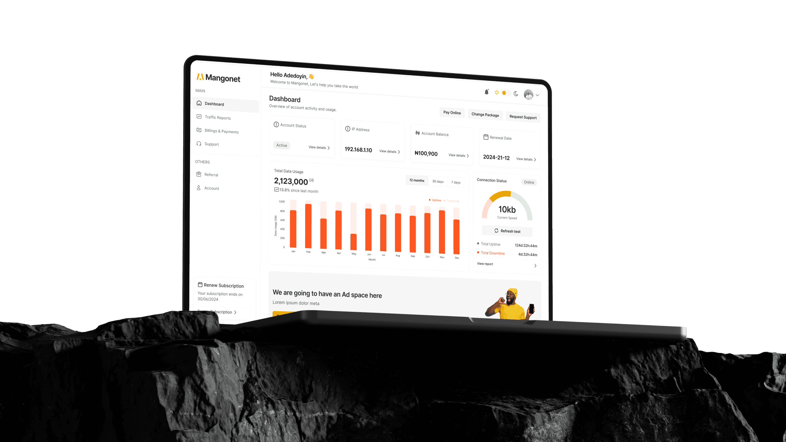
Dashboard
Dashboard
Dashboard
Quickly view your data balance, active plan, and billing status all in one place.
The dashboard provides a clear overview of data usage, active plans, and billing status allowing users to quickly monitor their account and take key actions at a glance.

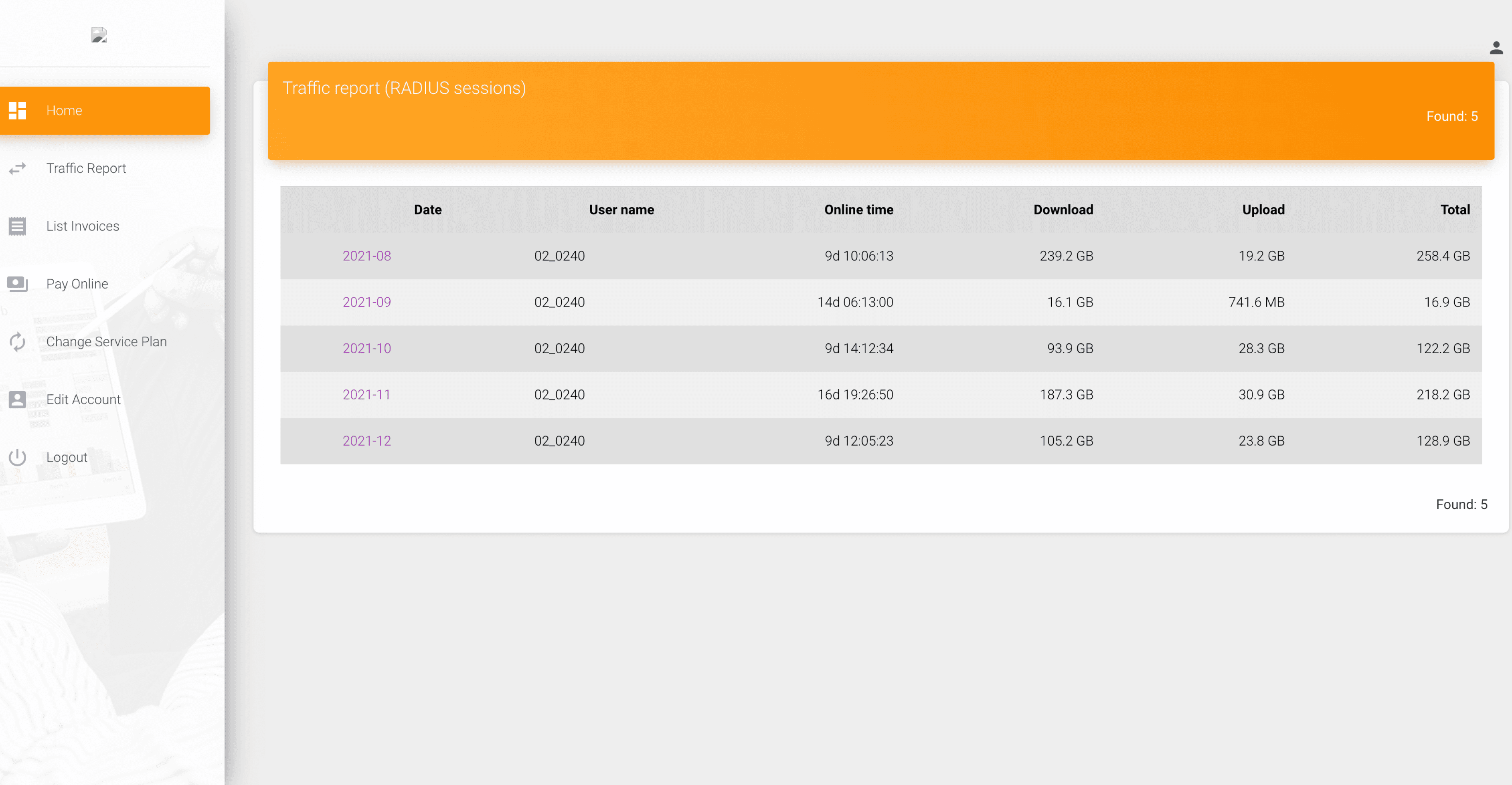
Traffic Report
Traffic Report
Traffic Report
Track your daily and monthly data usage to stay on top of consumption.
Track your daily and monthly data usage to stay on top of consumption.

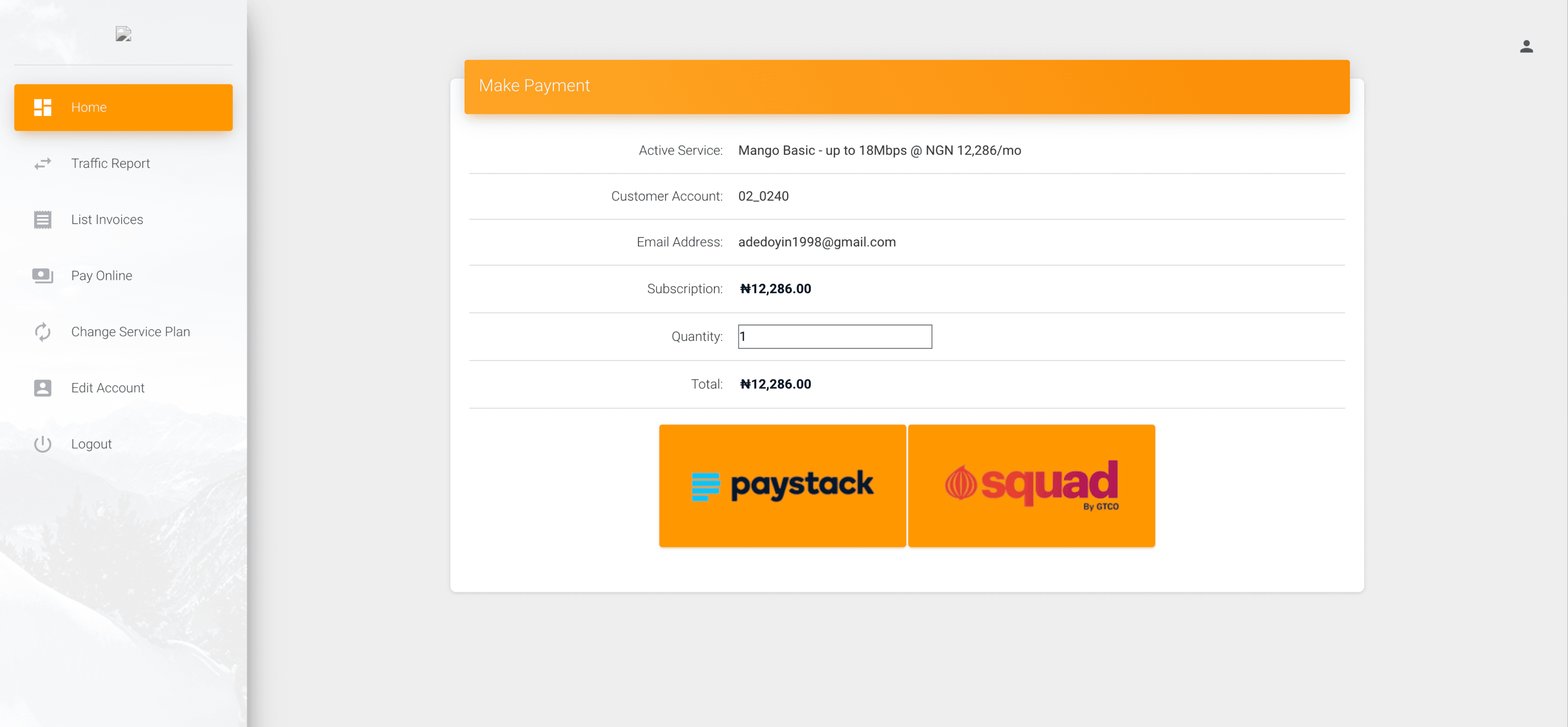
Billings & Payments
Billings & Payments
Billings & Payments
Easily view past invoices, manage payment methods, and pay your bills on time.
Easily view past invoices, manage payment methods, and pay your bills on time.
Easily view past invoices, manage payment methods, and pay your bills on time.

Support, Referral & Account
Support, Referral & Account
Support, Referral & Account
Access support, manage your referrals, and update account settings
all in one seamless experience that keeps users in control and connected.
Access support, manage your referrals, and update account settings all in one seamless experience that keeps users in control and connected.
Access support, manage your referrals, and update account settings
all in one seamless experience that keeps users in control and connected.


Responsive Mobile Design
Responsive Mobile Design
Responsive Mobile Design
Ensured responsiveness for user delight
Ensured responsiveness for user delight
Ensured responsiveness for user delight
Reflection
This was one of the most satisfying projects I’ve worked on, not just because it solved real problems I personally experienced, but because it reminded me how powerful small UX changes (like clearer grouping or button hierarchy) can be when paired with a scalable system. My key learnings include;
This was one of the most satisfying projects I’ve worked on, not just because it solved real problems I personally experienced, but because it reminded me how powerful small UX changes (like clearer grouping or button hierarchy) can be when paired with a scalable system. My key learnings include;
This was one of the most satisfying projects I’ve worked on, not just because it solved real problems I personally experienced, but because it reminded me how powerful small UX changes (like clearer grouping or button hierarchy) can be when paired with a scalable system. My key learnings include;
> Tokens make cross-theme management painless, i am definitely adopting for future work
> Sometimes, redesigns don’t need new features just clarity
> User testing doesn’t need to be expensive to be effective
> Tokens make cross-theme management painless, i am definitely adopting for future work
> Sometimes, redesigns don’t need new features just clarity
> User testing doesn’t need to be expensive to be effective
> Tokens make cross-theme management painless, i am definitely adopting for future work
> Sometimes, redesigns don’t need new features just clarity
> User testing doesn’t need to be expensive to be effective
Wednesday, Oct 8, 2025
1:06:11 PM
© 2025
Made with Love ❤️
Wednesday, Oct 8, 2025
1:06:11 PM
© 2025
Made with Love ❤️
Wednesday, Oct 8, 2025
1:06:11 PM
© 2025
Made with Love ❤️